For the curious, below you will find an interpretation of our company's logos. As with all art, each person will have their own impression. To assist our visually impaired visitors, the interpretation of the imagery is preceded by a description of the visual elements.
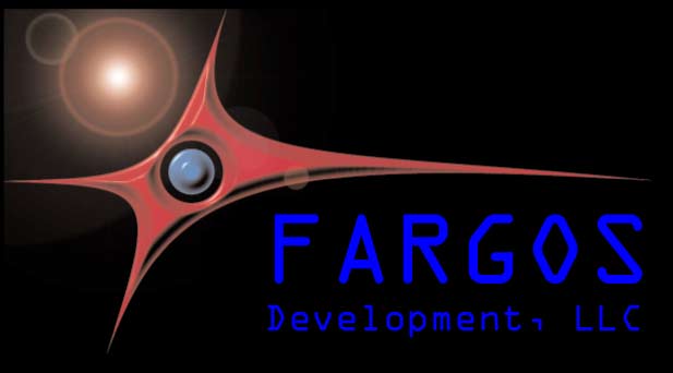
The complete FARGOS Development, LLC Logo consists of a solid black background with a star in the upper left corner. The image is enhanced with a lens-flare effect caused by the brightness of the star. These elements are absent when the logo is rendered on a background other than black (e.g., printed on white paper). This is illustrated below:

The foreground is dominated by a 4-pointed red polygon; each of the four corners are connected by convex arcs. The center of the red polygon is hollow and a blue sphere-like structure sits as an island within the hollow. Three-dimensional effects are applied to create slopes along every edge that touches the background. The logo was created for FARGOS Development, LLC by Freddie Flake.
Individuals with a medical background frequently view the FARGOS Development, LLC logo as a red blood cell. While we would be pleased to find our products as indispensable as a red blood cell is to humans, that's not realistic. An intended interpretation is to view the points of the red polygon as distinct hosts interconnected using applications that exploit the FARGOS/VISTA infrastructure. The blue circle at the center of things represents the FARGOS/VISTA core. The star in the background represents the dawning of a new day.
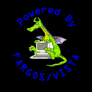
The "Powered by FARGOS/VISTA" logo is comprised of a ring of words that encircle a computer and a dragon. The top half of the ring contains the words "Powered By" and the bottom half contains the phrase "FARGOS/VISTA". The center of the image is comprised of two elements: a computer keyboard and display, behind which sits a not-very-scary dragon. The dragon's front paws rest on the top of the monitor and his back legs straddle the sides of the monitor and keyboard. The dragon's facial expression suggests that he might be academically-challenged. The dragon-and-computer image was drawn for Geoff Carpenter by the cartoonist Fenwick, whose signature appears when the logo is rendered on a background other than black.
The words "Powered By FARGOS/VISTA" are intended to be unambiguous and thus not open to artistic interpretation. The monitor and keyboard are intended to suggest something to do with computers. At the time the image was created (1992), the dragon was intended to be an explicit reference to DRAGONS (Distributed Reliable Architecture Governing Over Networks & Systems), which was the predecessor technology to FARGOS/VISTA. As used today, the distinctive logo serves both as an homage to prior work and as an indication that we believe that we have a sense of humor.
Copyright © 1999-2026 FARGOS Development, LLC
Last updated: January 10, 2026
Suggestions regarding this site may be sent to the webmaster@fargos.net; information regarding the design goals of this site is provided on the Site Design page.